Creating visual aids to accompany your blog posts can greatly enhance the reader’s understanding and engagement. While text explanations are helpful, structured visual content can provide clarity and a comprehensive view. In my search for an effective way to create these visuals, I initially used Google Jamboard. However, it proved cumbersome because I had to manually draw connecting lines between objects. Mind mapping was another option, but it required paid features to create the desired organization chart. 😥
Finally, I found the easiest and most effective method: using Google Sheets’ chart feature, specifically the org chart option. Let’s explore how to use this feature.
Getting Started with Google Sheets

First, ensure you have a Google account. You can access various Google apps, including Google Docs, Google Sheets, Google Slides, Google Jamboard, and Google Classroom, by clicking the 9-dot grid next to your account image. The major advantage of Google apps is their cloud-based nature, allowing continuous work from any device, and the ability to collaborate through sharing.
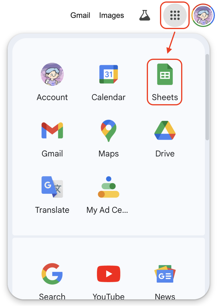
Click on Google Sheets to get started.
Creating a New Sheet
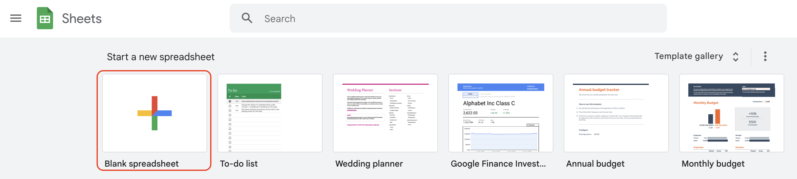
- Open Google Sheets: Click on the Google Sheets icon.
- Create a New Spreadsheet: Click on the “+” to create a blank spreadsheet.
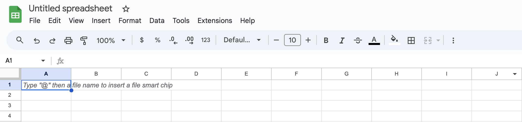
The interface should look familiar if you’ve used Excel before, but there are some differences. We’ll focus on creating an org chart today.
Inserting an Org Chart
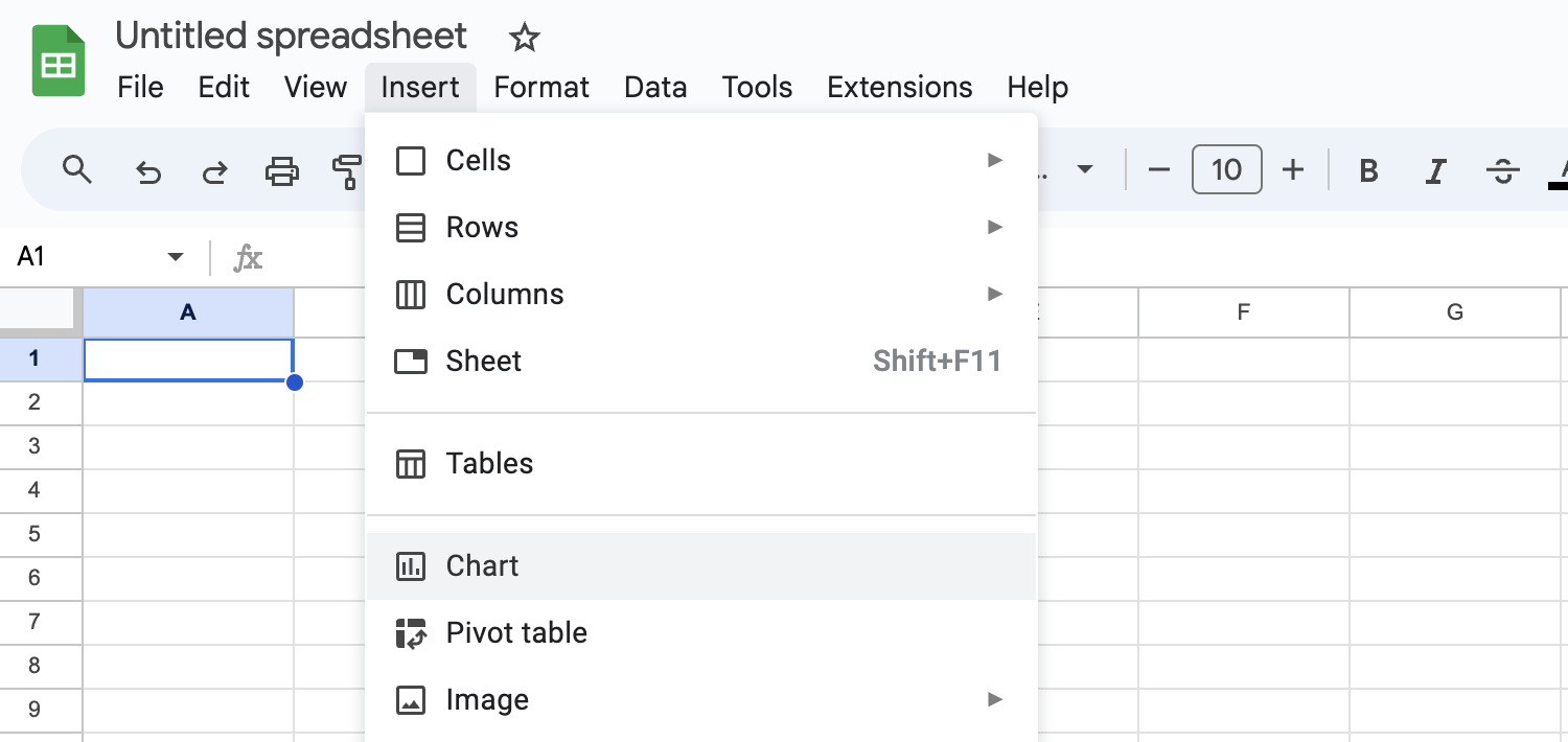
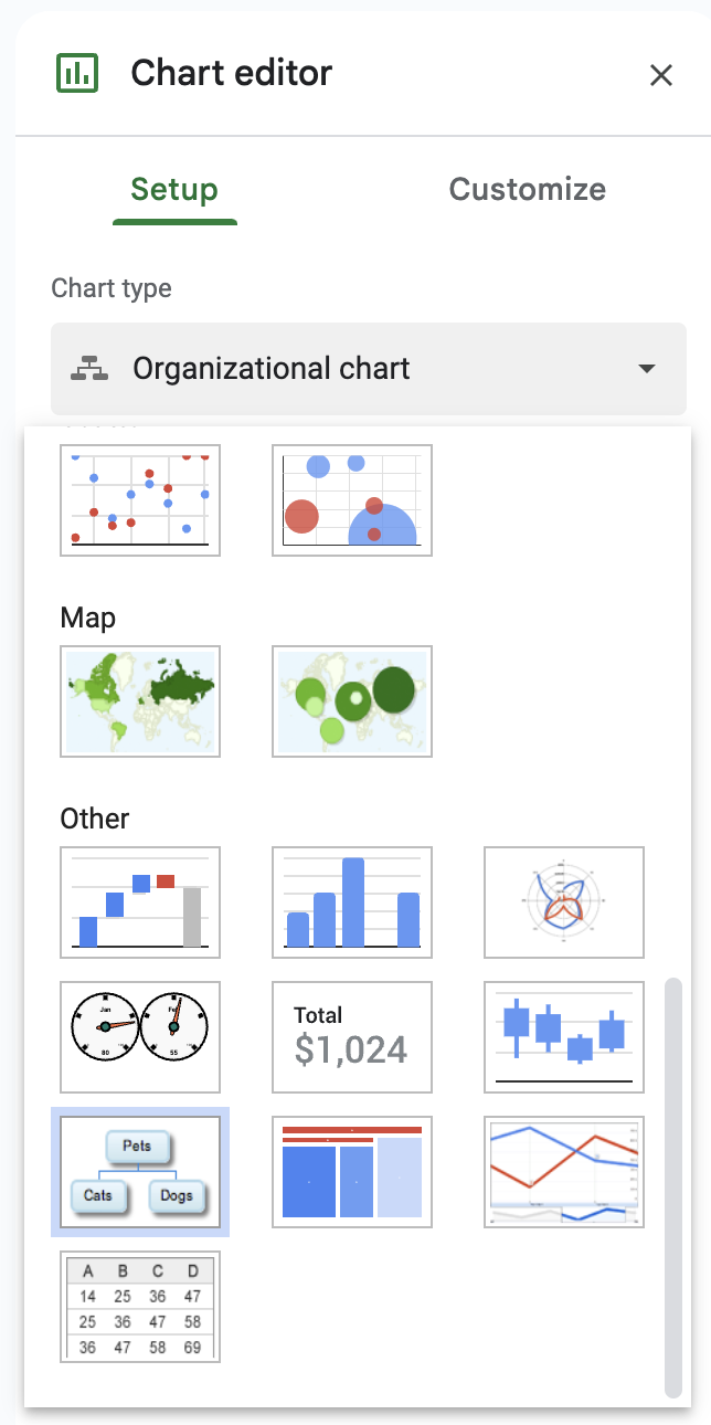
- Menu Navigation: Go to
Insert>Chart. - Chart Editor: In the Chart Editor on the right, select
Chart typeand chooseOrganizational chart.
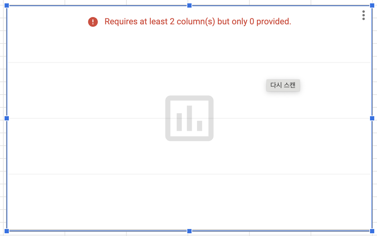
Your screen will now display a blank chart.
Inputting Data for the Org Chart
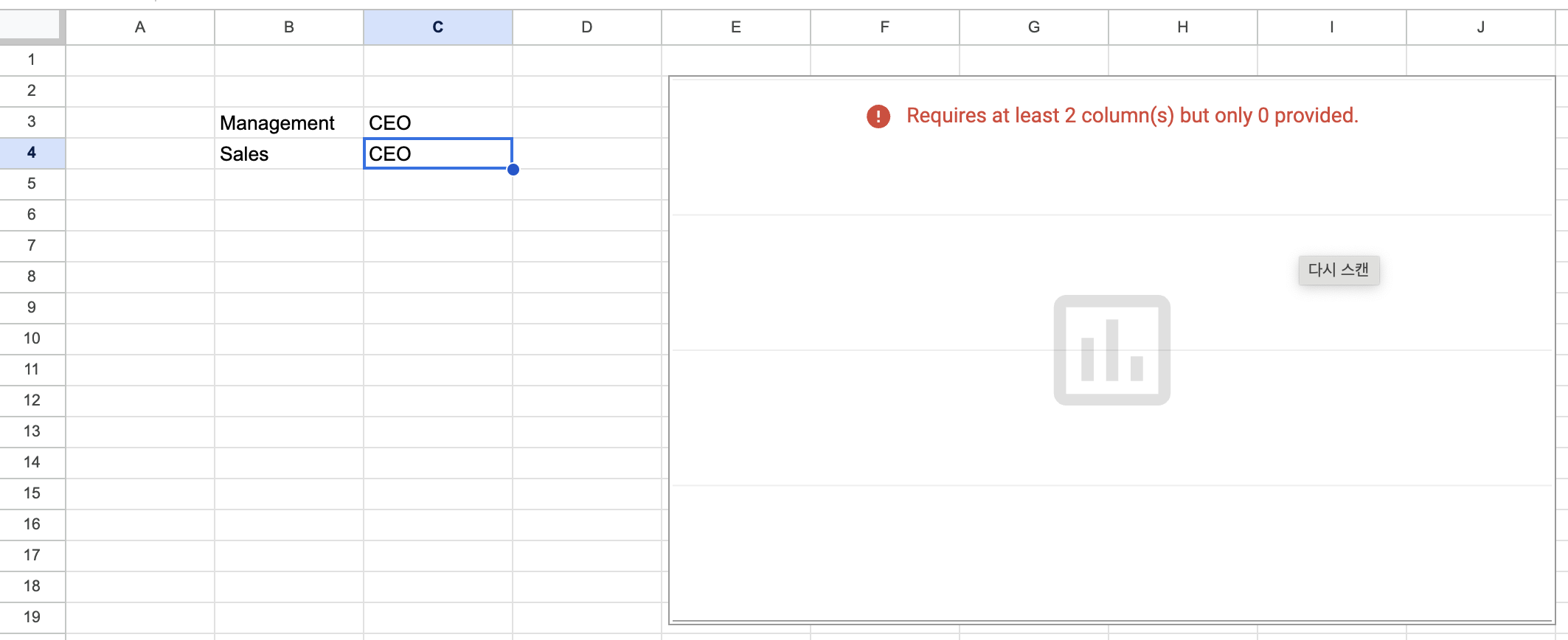
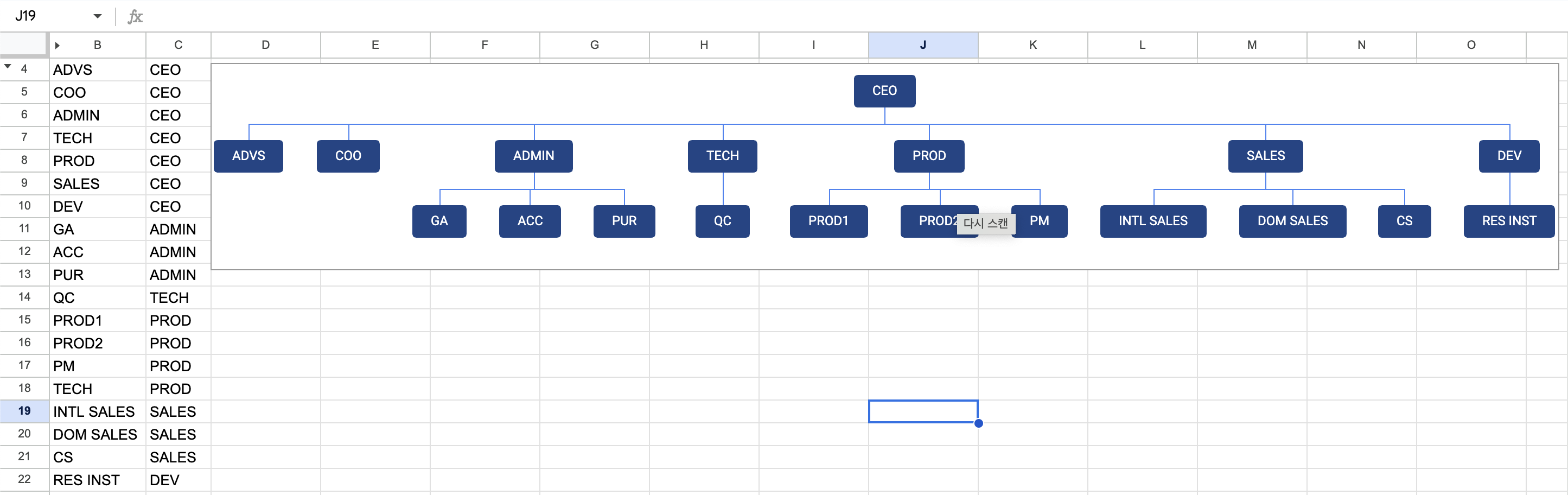
Enter your organization data in the cells next to the chart. For example, to create a company org chart with a management department and a sales department under a CEO, enter the following:
- B3: Management
- B4: CEO
- C3: Sales
- C4: CEO
Linking Data to the Org Chart
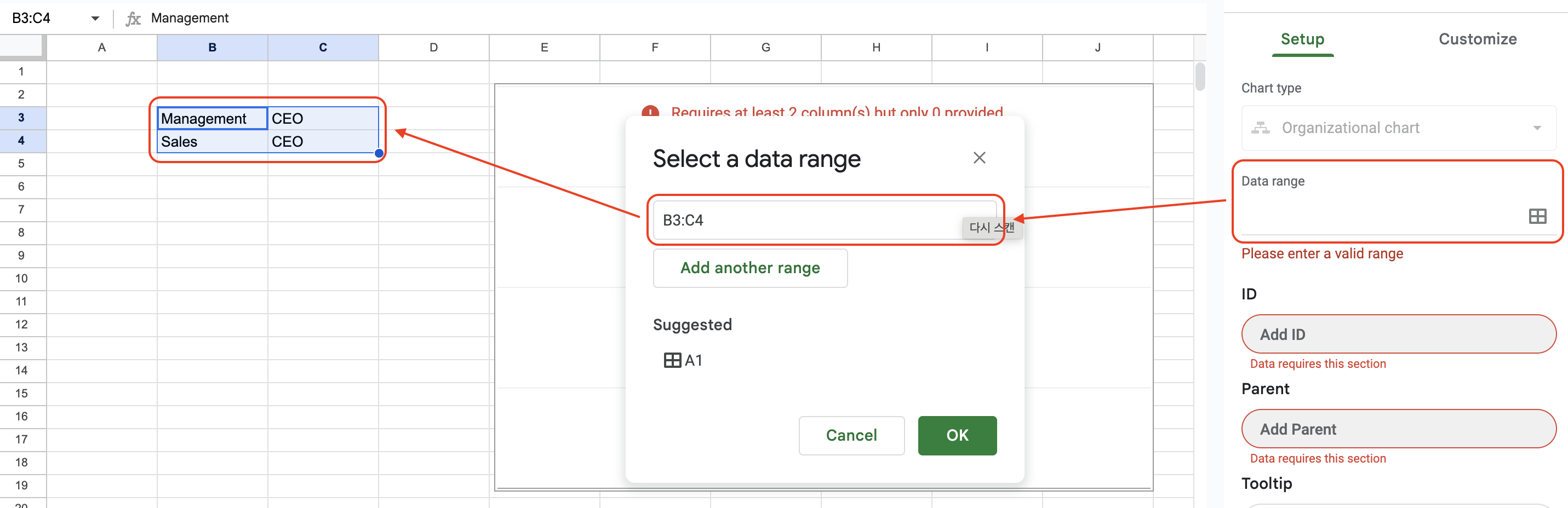
- Activate Chart Editor: Double-click the org chart to open the Chart Editor.
- Set Data Range: Click on
Data rangeand select or manually enter the rangeB3:C4.
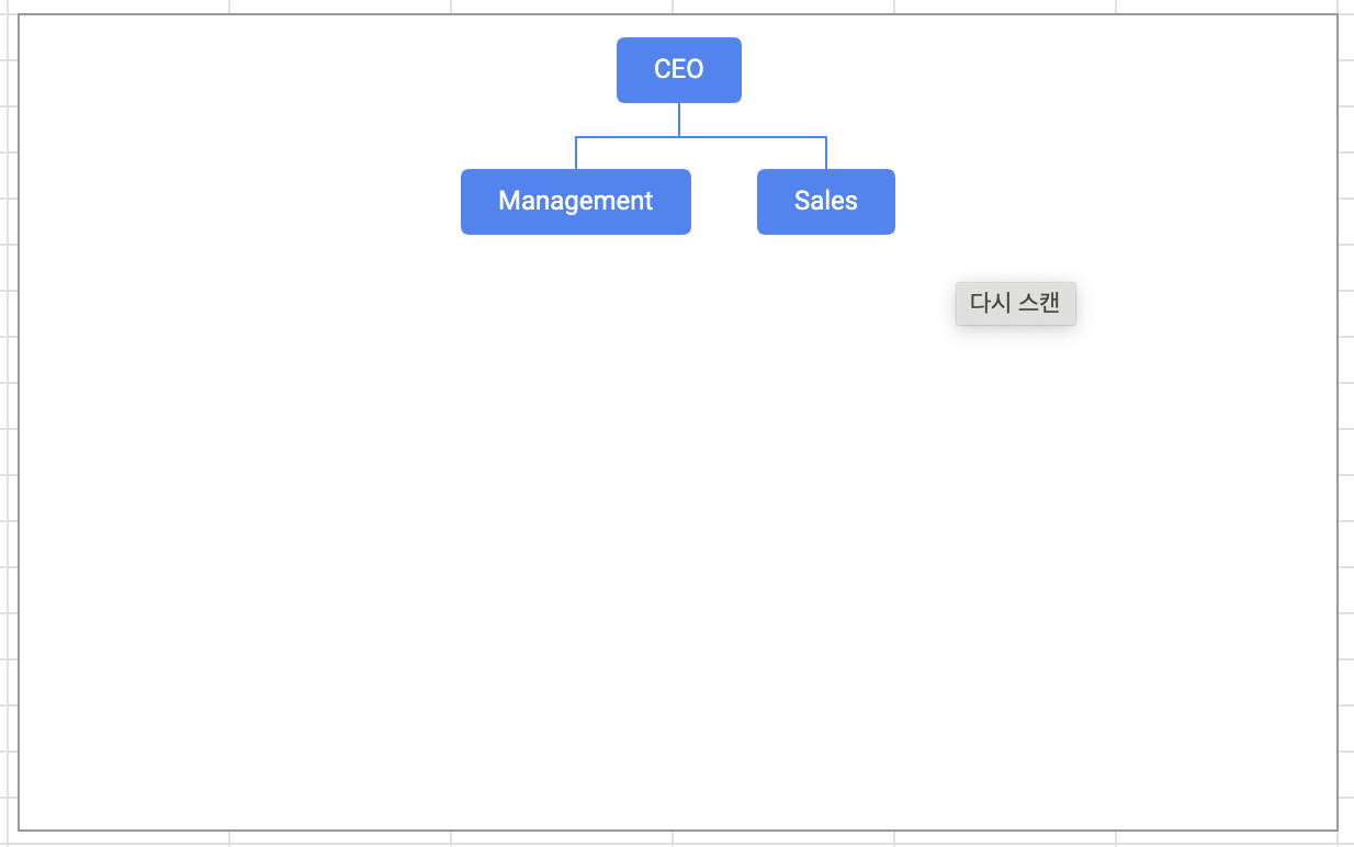
The org chart will automatically update with the entered data.
Customizing the Org Chart
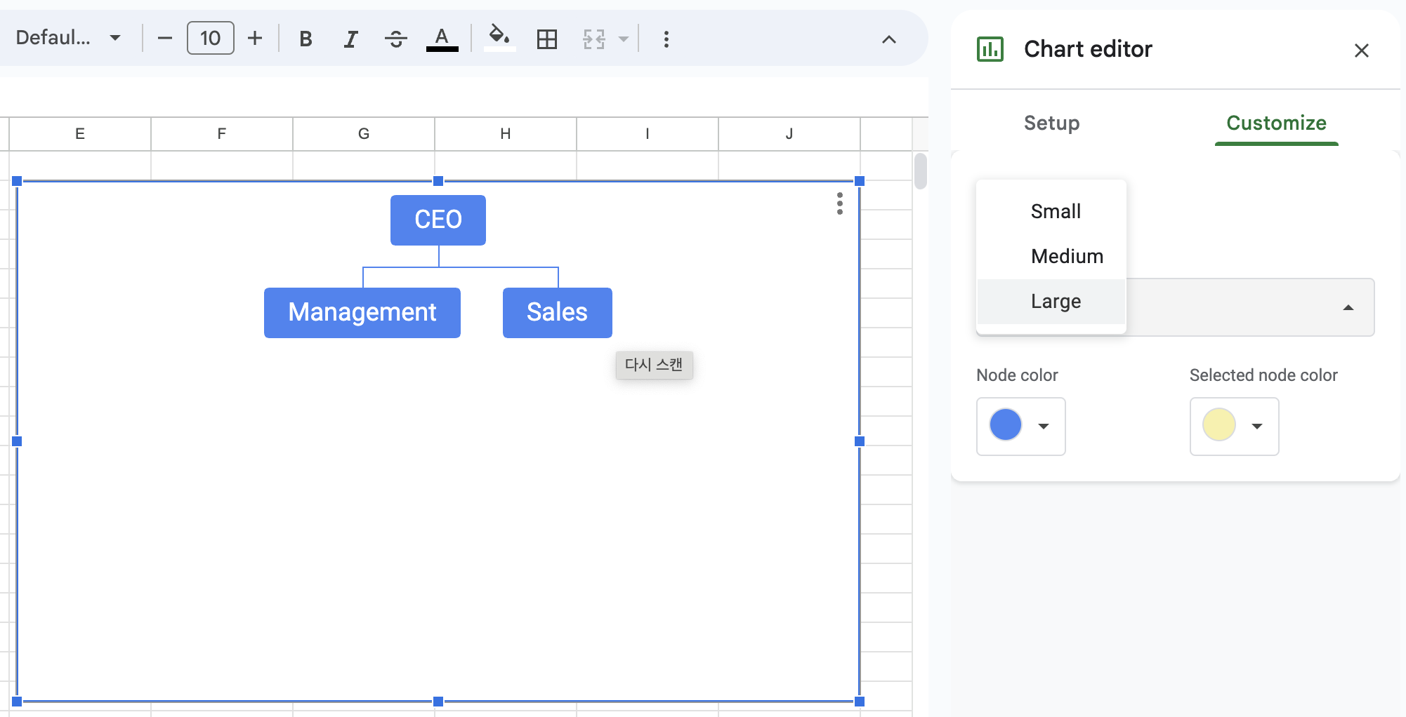
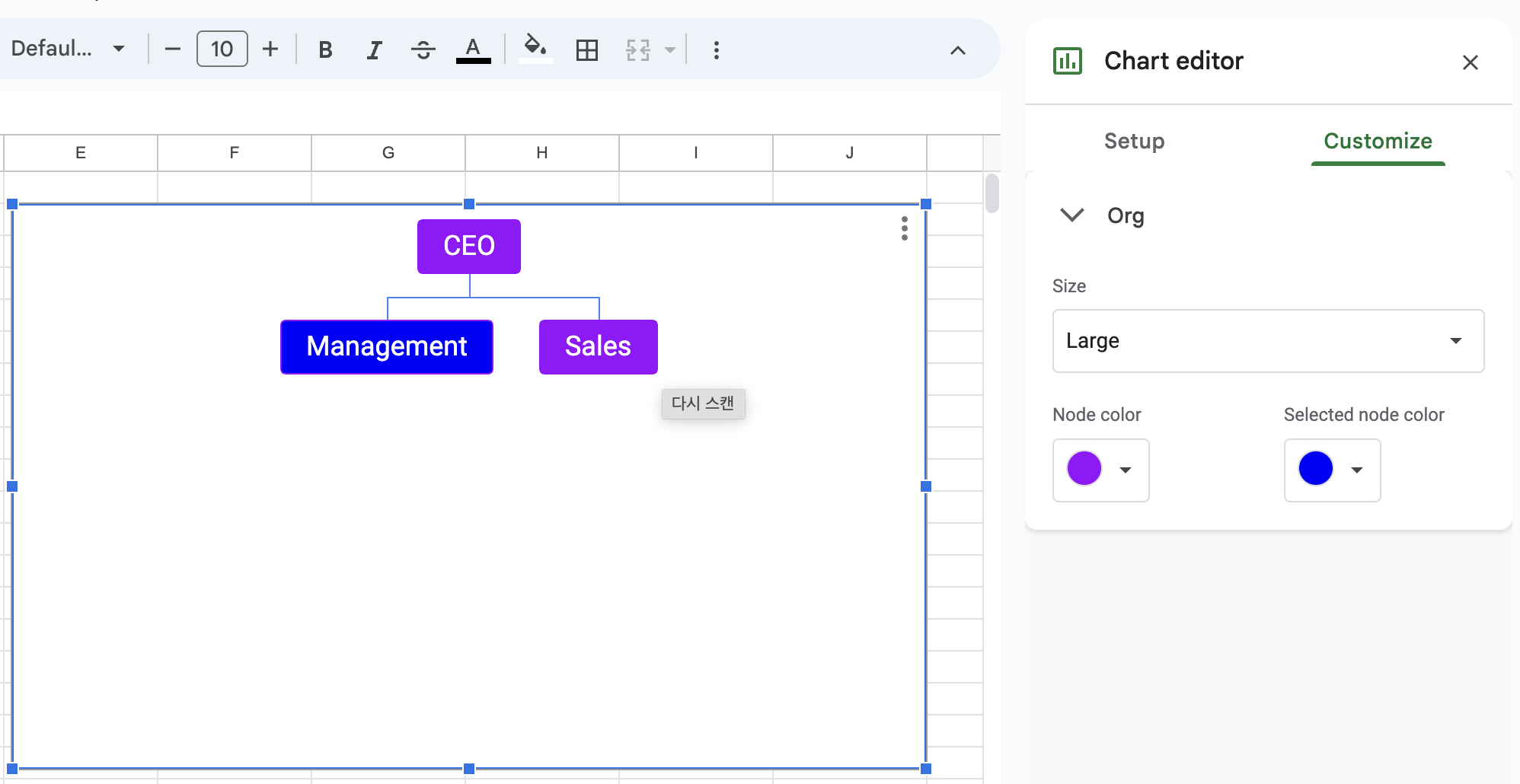
If you want to change the colors or text size:
- Chart Editor: Go to the
Customizetab in the Chart Editor. - Org Chart Options: Adjust text size and color settings. To change node colors, select the node and choose the desired color.
For example, you can make the text larger and change the overall color to black, with selected node colors in red.
Adding More Nodes
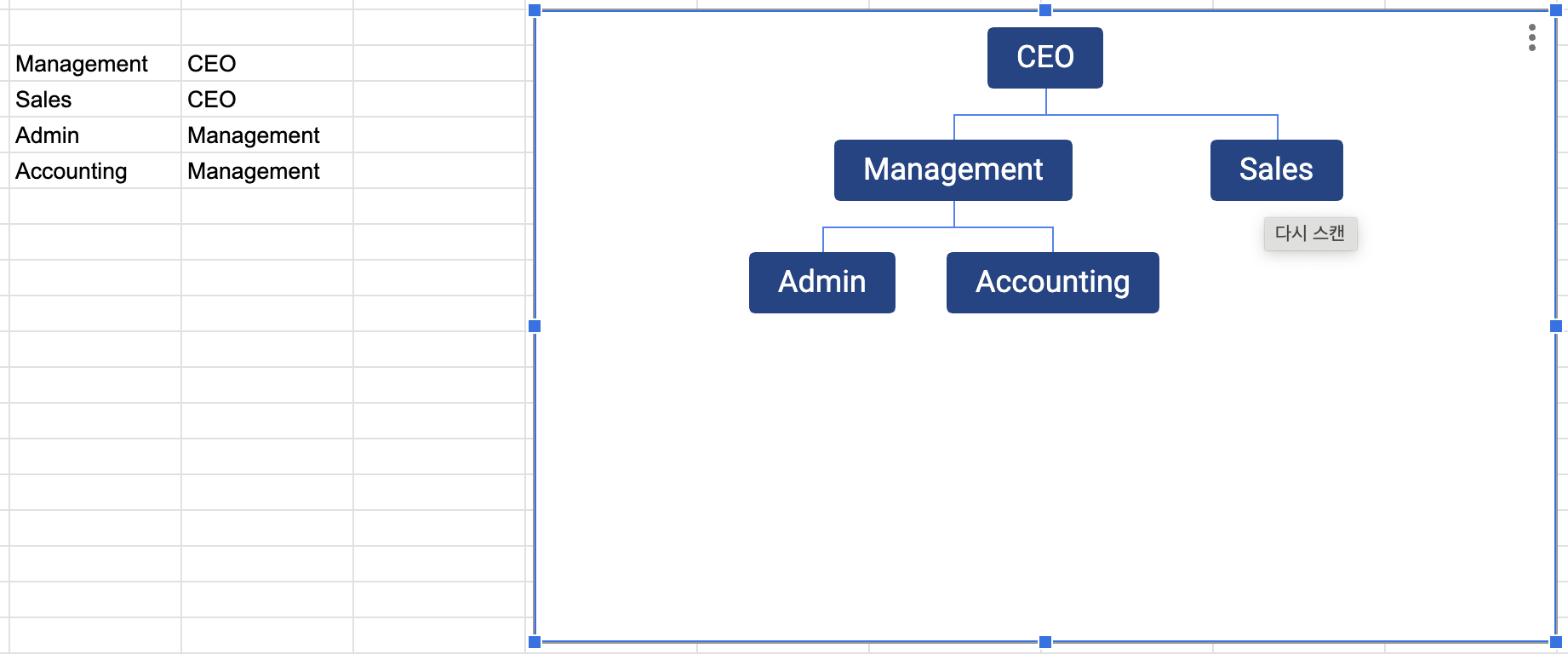
To add sub-departments like Admin and Accounting under Management:
- Enter Data: Add
Adminto B5 andAccountingto B6, Management to C5, C6 - Update Data Range: Open the Chart Editor and update the data range to
B3:C6.
The org chart will update accordingly. Ensure that sub-departments are in the same column as their parent department.
Common Issues and Limitations
- Connecting Multiple Nodes: Google Sheets’ org charts do not support connecting a single sub-node to multiple parent nodes.
- Horizontal Org Charts: Currently, only vertical org charts are supported.
If you know how to connect a sub-node to multiple parent nodes or create a horizontal org chart, please share in the comments!
Conclusion
Using Google Sheets to create org charts is a quick and efficient way to visualize your organization’s structure. It’s straightforward and offers enough customization to meet most needs. If you have questions or tips to share, please leave a comment!
For more information on creating other types of charts like line graphs using Google Sheets, refer to this guide.
How to Create a Line Chart in Google Sheets: A Beginner’s Guide
#Google Sheets #Google Sheets Org Chart