Creating visual representations of data can significantly enhance understanding and communication. Among the various types of charts available, line charts are particularly effective for displaying data trends over time. However, if you’re new to Google Sheets, creating a line chart might seem a bit daunting. Don’t worry! This step-by-step guide will help you create your first line chart with ease.
Step-by-Step Guide to Creating a Line Chart in Google Sheets

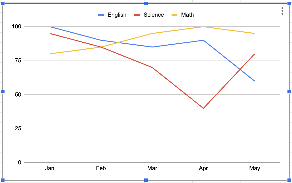
Let’s start by creating a simple data table. Here’s an example table showing the scores in three subjects (Math, English, Science) from January to May.
Open Google Sheets and Enter Your Data:
Go directly to spreadsheet
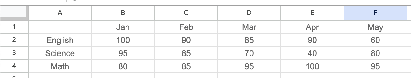
Create a table with months (January to May) as rows and subjects (Math, English, Science) as columns. Enter the corresponding scores for each subject in the table.
Insert a Chart:
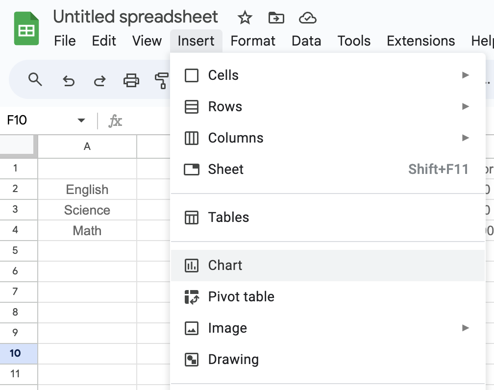
- Navigate to the menu and select Insert > Chart.
Select Line Chart Type:

- A chart editor will appear on the right side of the screen. In the Chart Editor, go to the Chart type section and select Line chart.
Select Data Range:
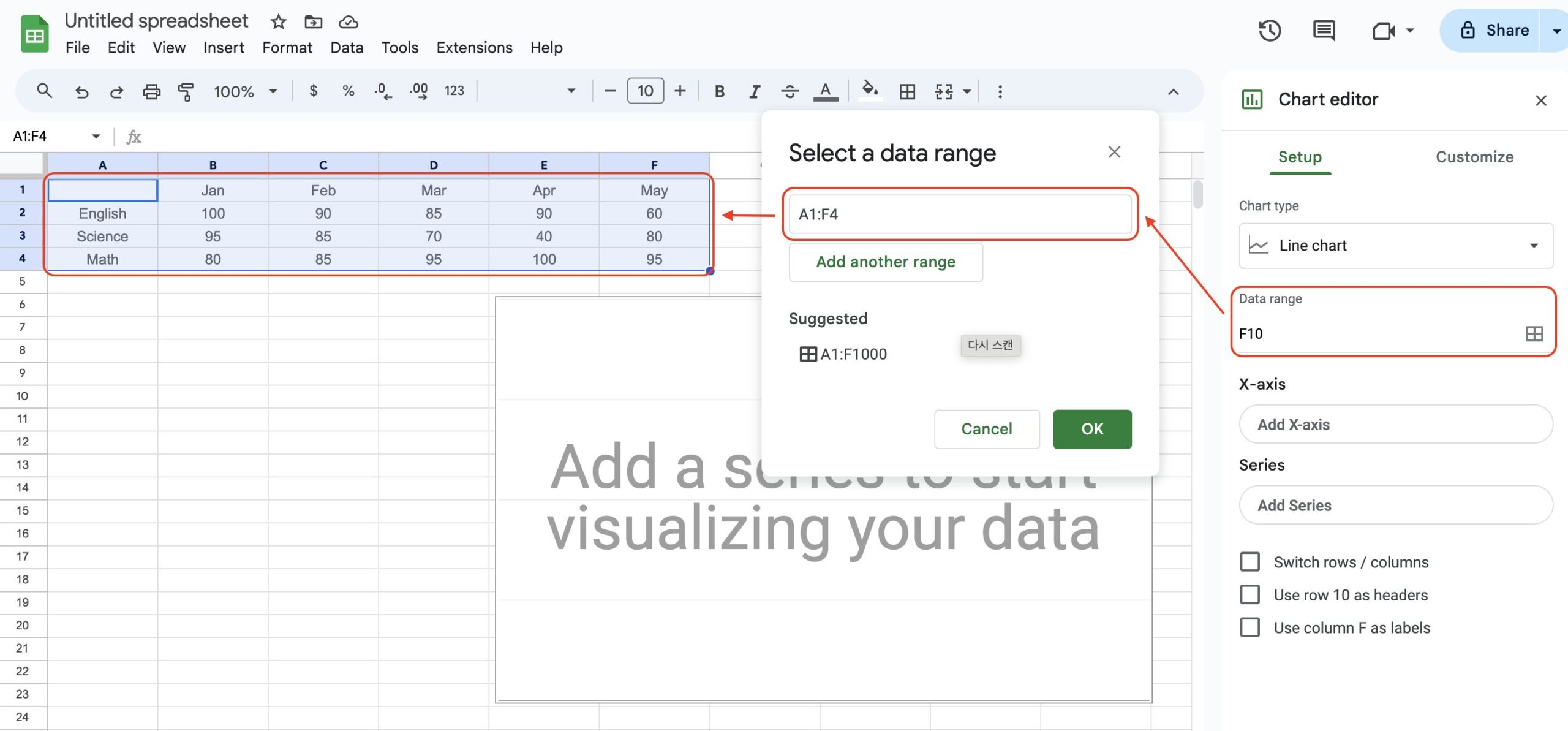
- Click on Data range in the Chart Editor.
- An input box will appear. Click on the box and then highlight the cells containing your data. Confirm your selection.
Automatic Line Chart Generation:

- Google Sheets will automatically generate a line chart based on your selected data range. However, sometimes the axes may not be correctly aligned.
Switch Axes if Necessary:
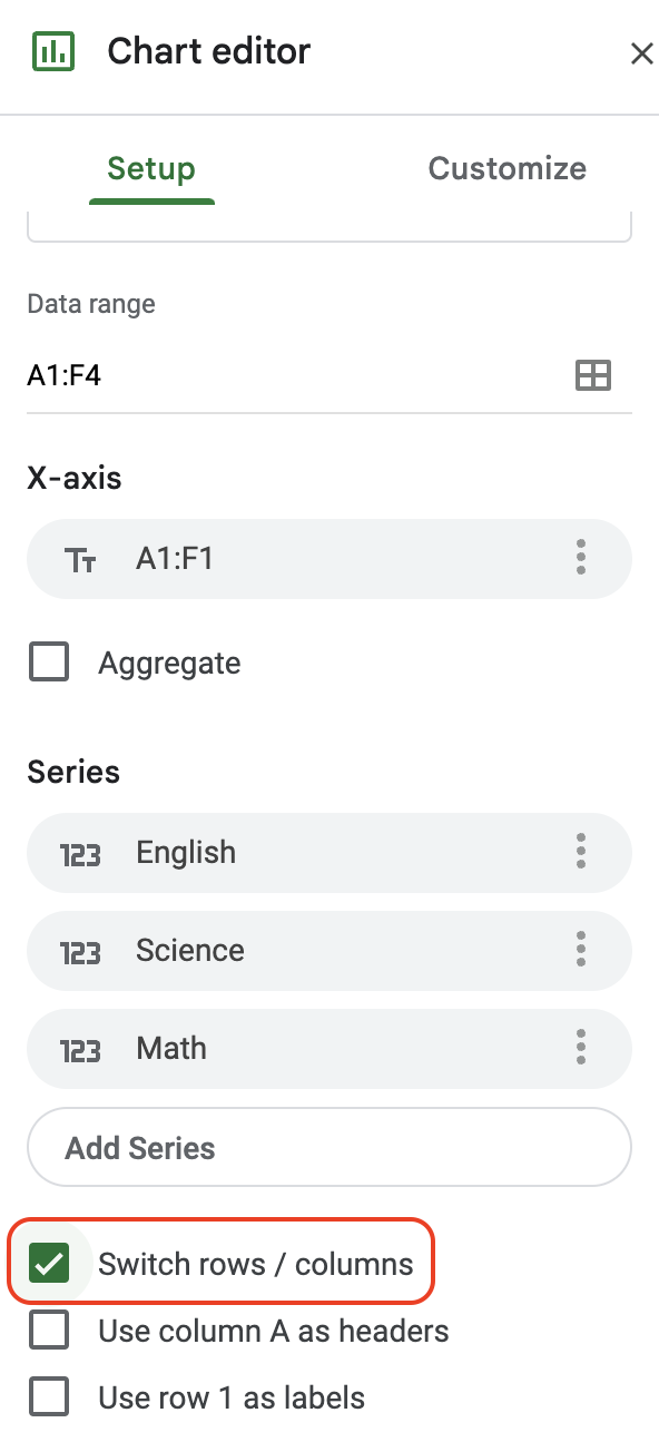
- If you notice that the X-axis and Y-axis are reversed, simply click on the Switch rows/columns button in the Chart Editor. This will correctly align your data.
Customize Your Chart:
- To further customize your chart, click on the Customize tab in the Chart Editor. Here, you can adjust various elements such as:
- Chart & axis titles: Edit the titles for clarity.
- Series: Change the color and style of the lines.
- Legend: Position the legend as desired.
- Gridlines and ticks: Adjust the appearance of gridlines for better readability.
Edit Legend Names:
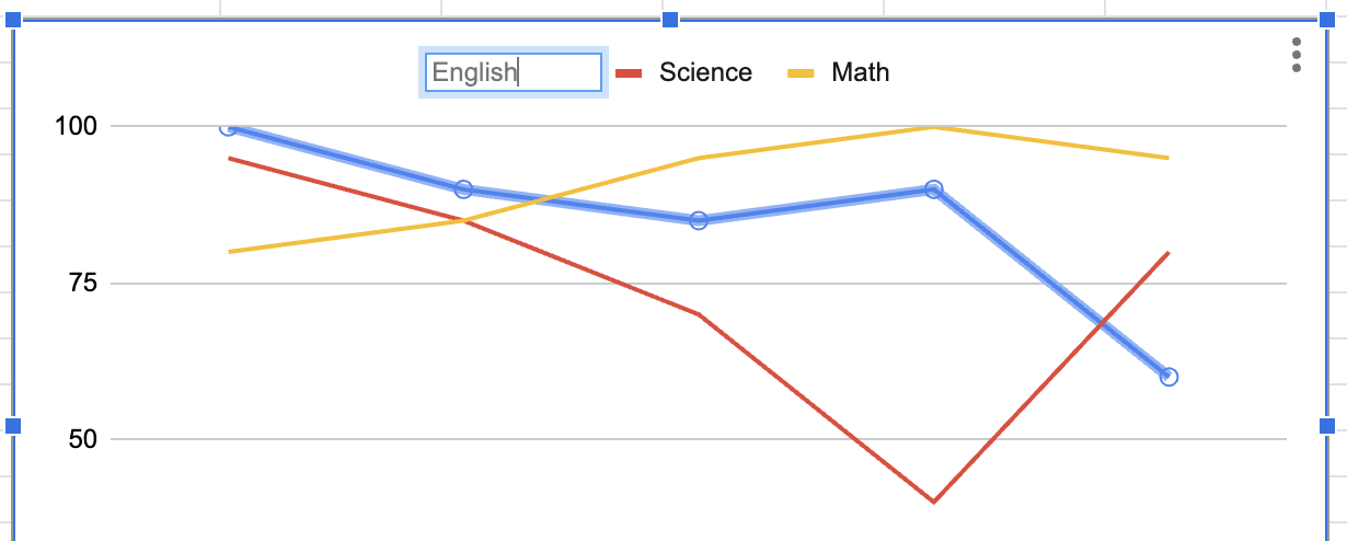
- If you want to rename the legends, double-click on the legend name directly in the chart. You can then type in the new name.
Final Touches
Once you’ve customized your chart to your satisfaction, you’ll have a clear and informative line chart. This visual tool can be a powerful way to present data trends and comparisons effectively.
Conclusion
Today, we explored the simple yet effective process of creating a line chart in Google Sheets. Despite initial appearances, the process is straightforward. Utilizing these charts can significantly enhance your data presentation skills, making it easier to communicate your insights clearly.
With this guide, even beginners can confidently create and customize line charts, transforming raw data into valuable visual insights. Happy charting!